Table of Contents Show
Introduction to Modern CSS
Modern CSS has transformed from a simple presentation layer into a powerful system for building scalable, responsive, and accessible user interfaces. As we move closer to 2026, CSS is no longer just about colors and spacing. It now plays a central role in layout logic, component architecture, and design systems.
In the early days of the web, CSS was primarily used to apply basic styling to HTML elements. Layouts were constructed using tables, floats, and positioning hacks that were difficult to maintain and fragile across browsers. As websites grew more complex, these approaches became increasingly unsustainable.
The evolution of CSS introduced purpose-built solutions such as Flexbox for one-dimensional layouts and CSS Grid for two-dimensional layout control. More recently, features like container queries, CSS nesting, logical properties, and advanced selectors have pushed CSS into a new era of component-driven, context-aware design.
Modern web applications must adapt to a wide range of devices, screen sizes, writing modes, accessibility needs, and embedding contexts. Modern CSS enables this adaptability without relying heavily on JavaScript, improving performance and reducing complexity.
Keeping up with modern CSS is critical because it directly impacts:
- Rendering performance and layout stability
- Scalability of design systems
- Developer productivity and maintainability
- Accessibility and internationalization support
As 2026 approaches, modern CSS is no longer optional. It is a foundational skill for frontend developers who want to build future-proof web experiences.
CSS Grid: Redefining Layout Architecture
CSS Grid is one of the most important advancements in modern CSS. It introduces a true two-dimensional layout system that allows developers to control rows and columns simultaneously. This fundamentally changes how page layouts are designed and implemented.
Before CSS Grid, developers relied on a combination of floats, inline-blocks, and positioning tricks to create complex layouts. These approaches were error-prone and required excessive markup. CSS Grid replaces these hacks with a declarative layout model that clearly defines structure.
Why CSS Grid Is Essential in 2026
- Explicit control over rows and columns
- Cleaner HTML with fewer wrapper elements
- Better alignment and spacing consistency
- Native support for responsive layouts
Basic CSS Grid Example
.layout {
  display: grid;
  grid-template-columns: repeat(3, 1fr);
  gap: 1.5rem;
}
CSS Grid excels in complex layouts such as dashboards, editorial pages, product listings, and admin interfaces. Features like grid areas allow developers to name layout regions, making large layouts easier to understand and maintain.
The introduction of subgrid further enhances Grid’s capabilities by allowing nested elements to inherit the grid structure of their parent. This is especially valuable for maintaining consistent alignment across complex component hierarchies.
In modern CSS workflows, Grid is typically used for page-level layout, while Flexbox handles internal alignment within components.
Flexbox: The Foundation of Responsive Components
Flexbox, short for Flexible Box Layout, remains a cornerstone of modern CSS. While CSS Grid excels at page-level layouts, Flexbox is optimized for one-dimensional layouts where content flows in a row or column.
Flexbox simplifies many layout challenges that were historically difficult to solve. Vertical centering, equal-height columns, dynamic spacing, and content reordering are all straightforward with Flexbox.
Key Advantages of Flexbox
- Automatic distribution of available space
- Content-aware sizing and alignment
- Flexible reordering without changing HTML
- Excellent browser support
Flexbox Example
.header {
  display: flex;
  align-items: center;
  justify-content: space-between;
}
Flexbox is widely used for navigation bars, card groups, forms, toolbars, and UI controls. Its ability to adapt naturally to content size makes it ideal for responsive components.
When combined with CSS Grid, Flexbox enables a hybrid layout approach that balances structure and flexibility, which is now considered a best practice in modern CSS architecture.
CSS Variables: Powering Modern Design Systems
CSS variables, also known as custom properties, are one of the most impactful modern CSS features for building scalable design systems. They allow developers to define reusable values directly in CSS and reference them throughout the stylesheet.
Unlike preprocessor variables, CSS variables participate in the cascade. This makes them dynamic and context-aware, enabling real-time theming and responsive adjustments without rewriting rules.
Benefits of CSS Variables
- Centralized control of design tokens
- Easy implementation of light and dark themes
- Reduced duplication and cleaner stylesheets
- Dynamic updates via media queries or JavaScript
CSS Variables Example
:root {
  --color-primary: #2563eb;
  --spacing-md: 1rem;
  --radius-sm: 6px;
}

.button {
  background-color: var(--color-primary);
  padding: var(--spacing-md);
  border-radius: var(--radius-sm);
}
In modern CSS architecture, variables act as the foundation of design tokens, ensuring consistency across components while remaining flexible enough to evolve.
CSS Nesting: Cleaner, More Maintainable Stylesheets
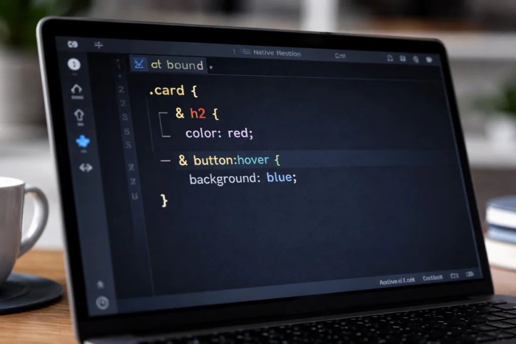
CSS nesting is one of the most important modern CSS features introduced in recent years. It allows developers to nest selectors inside one another, reducing repetition and improving readability.
Native CSS nesting allows developers to write hierarchical styles without preprocessors. For a deep dive into syntax, browser support, and real-world usage, see our complete guide: Native CSS Nesting Explained (2026 Guide).
Historically, nesting was only available through preprocessors like Sass. Native CSS nesting brings this capability directly into the browser, aligning styles more closely with component structure.
Why CSS Nesting Matters
- Improves readability of complex stylesheets
- Reduces selector repetition
- Aligns CSS with component-based architectures
- Minimizes specificity issues
CSS Nesting Example
.card {
  padding: 1.5rem;
  border-radius: 8px;

  & h3 {
    margin-bottom: 0.5rem;
  }

  & p {
    color: #555;
  }

  & .actions {
    display: flex;
    gap: 1rem;
  }
}
CSS nesting makes stylesheets more intuitive by grouping related rules together. This is especially valuable in large projects where maintainability is a primary concern.
Modern CSS Selectors: Smarter Targeting
Modern CSS selectors significantly enhance how developers target elements. These selectors reduce the need for excessive classes and JavaScript-based styling logic.
The :has() pseudo-class is particularly transformative, allowing parent elements to be styled based on their children. This unlocks patterns that were previously impossible using CSS alone.
Important Modern Selectors
- :has() for parent-aware styling
- Advanced attribute selectors for state management
- Structural selectors for cleaner HTML
:has() Example
.card:has(img) {
  padding-top: 0;
}
These selectors promote semantic HTML and align perfectly with component-driven development.
Container Queries: True Component Responsiveness
CSS Container queries represent a paradigm shift in responsive design. Instead of responding to viewport size, components can now adapt based on the size of their container.
This solves long-standing issues where components behaved unpredictably when reused in different layouts. Container queries enable truly modular UI components.
Why Container Queries Are Game-Changing
- Component-level responsiveness
- Better reuse across layouts
- Reduced reliance on global breakpoints
- More scalable design systems
Container Query Example
.card {
  container-type: inline-size;
}

@container (min-width: 600px) {
  .card {
    display: grid;
    grid-template-columns: 2fr 1fr;
  }
}
As we move into 2026, container queries are becoming a standard tool for modern responsive design.
Advanced Animation Techniques with Modern CSS
Modern CSS animation capabilities allow developers to create smooth, performant interactions without heavy reliance on JavaScript. When used correctly, animations enhance usability and perceived performance.
CSS Animation Best Practices
- Prefer transform and opacity for performance
- Avoid excessive or distracting animations
- Respect reduced-motion preferences
- Use variables for consistent timing
Animation Example
.fade-in {
  animation: fadeIn 0.5s ease-in-out;
}

@keyframes fadeIn {
  from { opacity: 0; }
  to { opacity: 1; }
}
CSS Modules and Scoped Styles
As applications scale, global CSS becomes difficult to manage. CSS Modules and scoped styles solve this problem by encapsulating styles at the component level.
Scoped styling prevents unintended overrides, improves collaboration, and aligns with modern frontend frameworks.
Conclusion: Embracing the Future of CSS
Modern CSS in 2026 is powerful, expressive, and essential. Features such as CSS Grid, Flexbox, CSS variables, nesting, container queries, and advanced selectors redefine how web interfaces are built.
Developers who embrace these tools gain a significant advantage in performance, maintainability, and user experience. The future of CSS is not just about styling, but about building resilient, scalable systems for the modern web.


