Table of Contents Show
Typography and visual hierarchy play a crucial role in effective communication. Whether you’re designing a website, creating a logo, or designing a print advertisement, understanding the principles of typography and visual hierarchy can make all the difference in conveying your message clearly and engaging your audience.
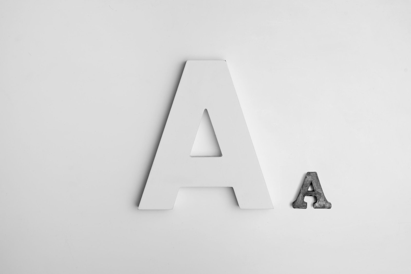
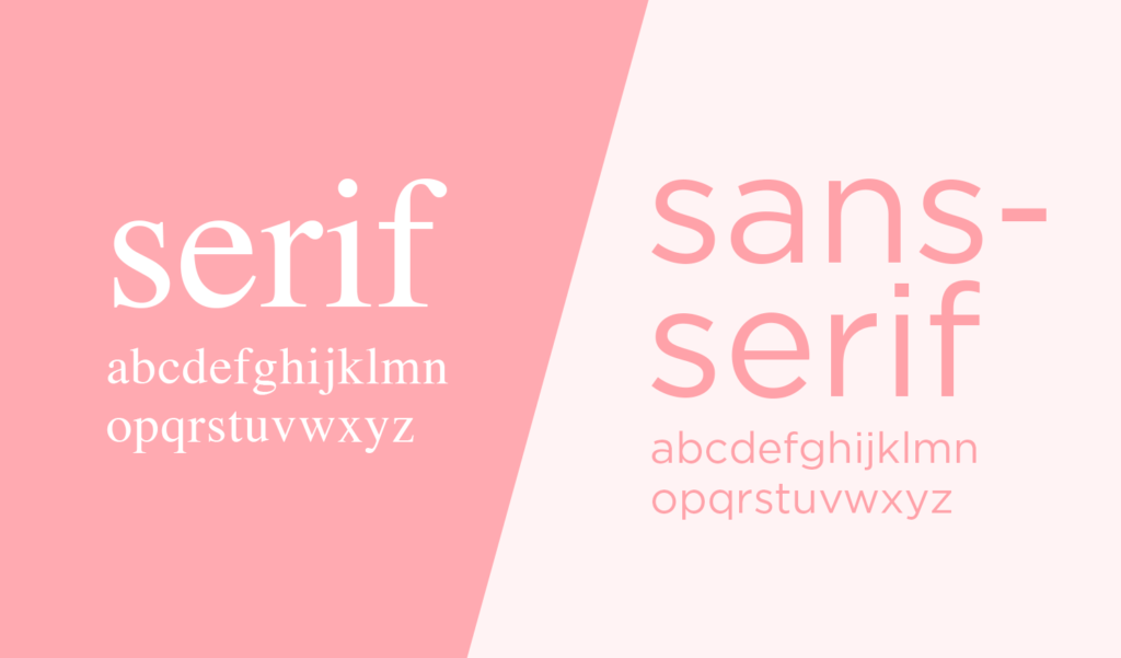
Typography refers to the art and technique of arranging type to make written language readable and visually appealing. It involves choosing the right typefaces, font sizes, line spacing, and letter spacing to create a harmonious and legible design.
Visual hierarchy, on the other hand, is the arrangement and organization of elements in a design to guide the viewer’s attention and prioritize information. It helps users navigate through the content and understand the message hierarchy.
The Importance of Typography
Typography is more than just selecting a font. It sets the tone and personality of your design. Here are a few reasons why typography is important:
- Readability: The primary purpose of typography is to make text readable. Choosing the right typeface and optimizing line spacing and letter spacing can significantly improve readability.
- Visual Appeal: Typography adds visual interest to your design. Different typefaces have unique characteristics that can evoke specific emotions and convey the intended message.
- Brand Identity: Typography plays a crucial role in brand identity. Consistent use of typography across different communication channels helps establish a recognizable brand identity.
- Accessibility: Good typography ensures that everyone can access and understand your content, including people with visual impairments or reading difficulties.
Visual Hierarchy in Design
Visual hierarchy helps guide the viewer’s attention and communicate the importance of different elements in a design. Here are some techniques to create an effective visual hierarchy:
- Size and Scale: Larger elements tend to grab more attention. By varying the size of text and other design elements, you can create a visual hierarchy that guides the viewer’s eye.
- Contrast: Contrast in color, typography, and shape can help differentiate important elements from less important ones. Bold or brightly colored text can draw attention to key messages.
- Whitespace: Whitespace, or negative space, is the empty space between elements. It helps create a sense of balance and separation, allowing the viewer to focus on the essential elements.
- Alignment and Proximity: Grouping related elements together and aligning them creates visual cohesion and makes it easier for the viewer to understand the relationship between different elements.
Combining Typography and Visual Hierarchy
Typography and visual hierarchy go hand in hand. By combining these two principles, you can create designs that effectively communicate your message. Here are some tips:
- Choose the Right Typeface: Different typefaces have different personalities and convey different emotions. Choose a typeface that aligns with your brand and the message you want to convey.
- Use Hierarchy in Typography: Vary font sizes, weights, and colors to create a visual hierarchy within your text. Highlight important words or phrases to guide the reader’s attention.
- Consider the Medium: Different mediums require different approaches. Consider the context in which your design will be viewed and adapt your typography and visual hierarchy accordingly.
- Keep it Simple: Avoid using too many different fonts or styles. Stick to a few key typefaces and use them consistently to maintain visual coherence.
In Conclusion
Typography and visual hierarchy are essential elements of effective design. By understanding the principles behind typography and visual hierarchy, you can create designs that are visually appealing, readable, and communicate your message effectively. So next time you embark on a design project, remember the power of typography and visual hierarchy in shaping the way your audience perceives and engages with your work.


